# tidyverse
library(dplyr)
library(ggplot2)

# for file paths relative to our R project location
library(here)

# mapping packages--functions specified in code below
#library(sf)
#library(terra)  # for plotting population as dots


# cancensus
library(cancensus)
# set cache directory
options(cancensus.cache_path = here::here("post", "2023-12-03_dot_map", "cache_cancensus"))


# API key
# set API key (stored in text file "secretAPI.txt")
secret_API_cancensus <- readLines(here("post", "2023-12-03_dot_map", "scripts", "secret_API_cancensus.txt"))
options(cancensus.api_key = secret_API_cancensus)Population density map
data science
using R
mapping
population
Inspired by a Linkedin post by Kyle Walker, I decided to take a crack at creating a dasymetric dot-density map. Here’s my hometown of Victoria, BC, using #rstats to show data from Statistics Canadaa’s 2021 Census of Population at the Census Tract level.
Daysymetric dot-density maps are a great way to show population. The density of the dots is proportional to the number of individuals, so that geographically large areas don’t overwhelm our perceptions. This is particularly the case in mapping regions that combine urban and rural areas; the large but comparatively sparsely populated rural areas dominate our view.
For the 2023 #30DayMapChallenge, the 27th day was “Dots” and Kyle Walker made a nice map of the Seattle area, showing the density of people by their race, using data from the US Census through the R package {tidycensus}. I was inspired by that map to create a daysymetric dot-density map of my hometown, Victoria, British Columbia, Canada.
Project setup
My first step was to get the data I need from the Canadian Census. While {tidycensus} is for the USA, in Canada we can leverage the {cancensus} package. This package gives us direct access to tidied Census data that Statisics Canada makes available under an open license.1
The {cancensus} package requires an API key, which I have saved in a separate file “secret_API_cancensus.txt”. As well, the package allows for the storing of calls in a local cache; this not only speeds up your calls, but also ensures that you don’t run into the server limits.
Get the data
Once we have the packages loaded and our options set, we can call the data we need.
The Canadian Census data has a huge number of variables—7,709 in total! We don’t need them all for our map. We can see what they are using the function cancensus::list_census_vectors("CA21"), where the “CA21” refers to the 2021 Census.
To specify the ones we want, we can create a list of “vector numbers”, which are the way in which StatCan identifes specific variables in their vast data holdings, for the Census of Population and beyond. This table shows the first eight, which happen to include the ones we will use in our maps.
| vector | type | label | units | parent_vector |
|---|---|---|---|---|
| v_CA21_1 | Total | Population, 2021 | Number NA | |
| v_CA21_2 | Total | Population, 2016 | Number NA | |
| v_CA21_3 | Total | Population percentage change, 2016 to 2021 | Number | NA |
| v_CA21_4 | Total | Total private dwellings | Number | NA |
| v_CA21_5 | Total | Private dwellings occupied by usual residents | Number | v_CA21_4 |
| v_CA21_6 | Total | Population density per square kilometre | Ratio | NA |
| v_CA21_7 | Total | Land area in square kilometres | Number | NA |
| v_CA21_8 | Total | Total - Age | Number | NA |
# list of vectors with the 2021 Census data
vector_list <- c(
  "v_CA21_1",
  "v_CA21_2",
  "v_CA21_3",
  "v_CA21_4",
  "v_CA21_5",
  "v_CA21_6",
  "v_CA21_7",
  "v_CA21_8"
  )
Next we use the get_census() function to create a “sf” object, with the data and the corresponding shapes. In our code we specify the Census Metropolitan Area (CMA) number (Victoria is 59935, with the 59 referring to British Columbia), and the level of geography at the Census Tract (or “CT”).
Note the the get_census() function will also allow you to query a table with just the data, as well as options for other spatial formats beyond “sf”.
cma_num <- "59935"

# Return an sf-class data frame
victoria_cma_sf <- get_census(
  dataset='CA21',
  regions=list(CMA=cma_num),
  vectors=c(vector_list),
  level='CT',
  quiet = TRUE,
  geo_format = 'sf',
  labels = 'short'
  )
The “victoria_cma_sf” dataframe contains 84 rows, one for each of the Census Tracts in the Census Metropolitan Area.
Start plotting
We can use this dataframe to plot an unadorned map of the region, showing the boundaries of the various Census Tracts. This uses geom_sf() within a ggplot() function. How easy is that?
map_ct <- ggplot(victoria_cma_sf) +
  geom_sf()

map_ct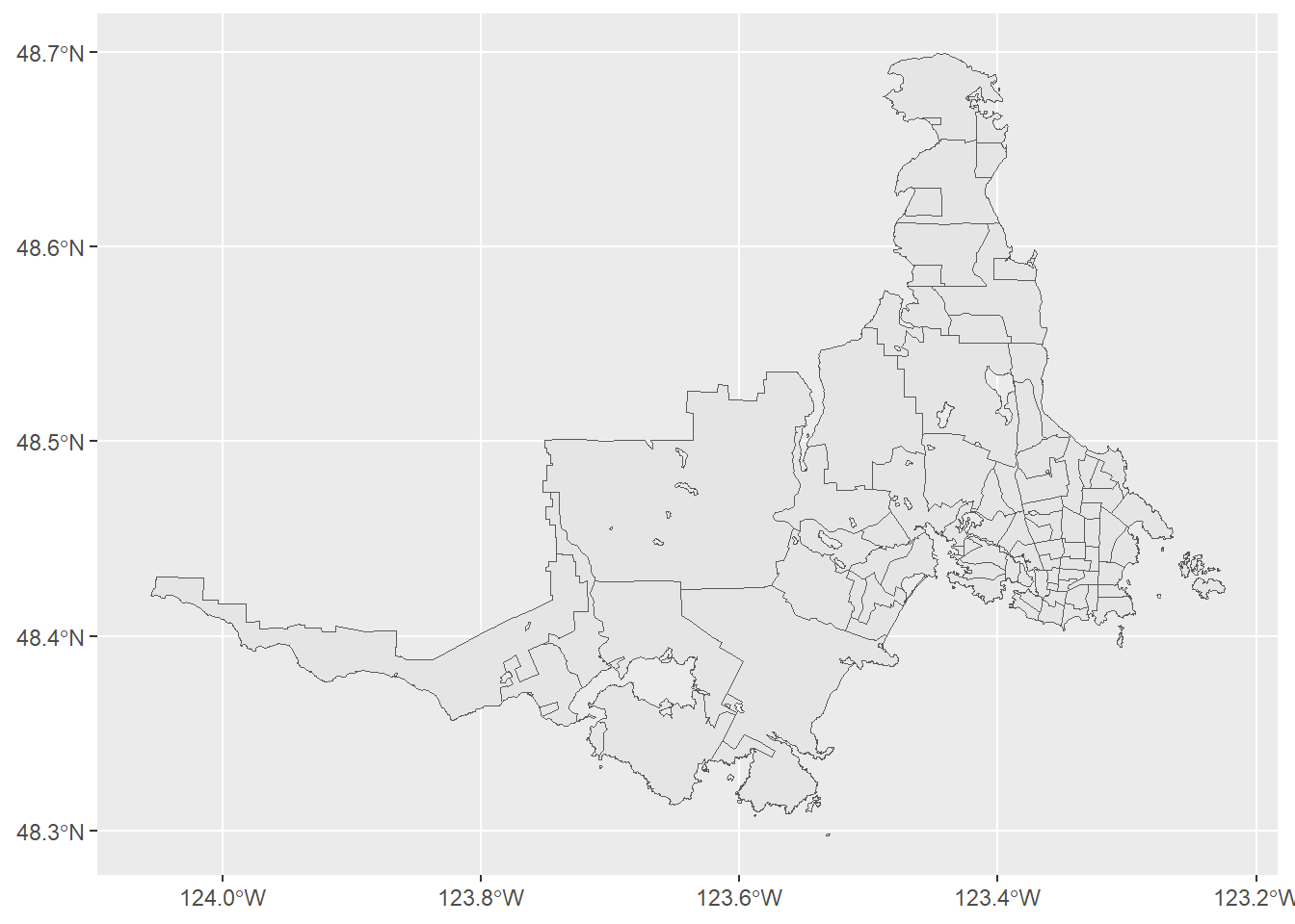
Choropleth map
One way we often see population mapped is as a choropleth, with the areas shaded by the value of the variable we are plotting. The vector number “v_CA21_1” contains the total population of each of the CTs; it’s used as the aes() within the geom_sf().
One of the problems with this approach is that we end up with a smudge of shades of blue (with the default palette). The reason for this is that when determining the boundaries of the CTs, Statistics Canada strives to hold them to below 7,500 persons.2 A daysymetric dot-density map will help resolve this.
map_ct +
  geom_sf(aes(fill = v_CA21_1))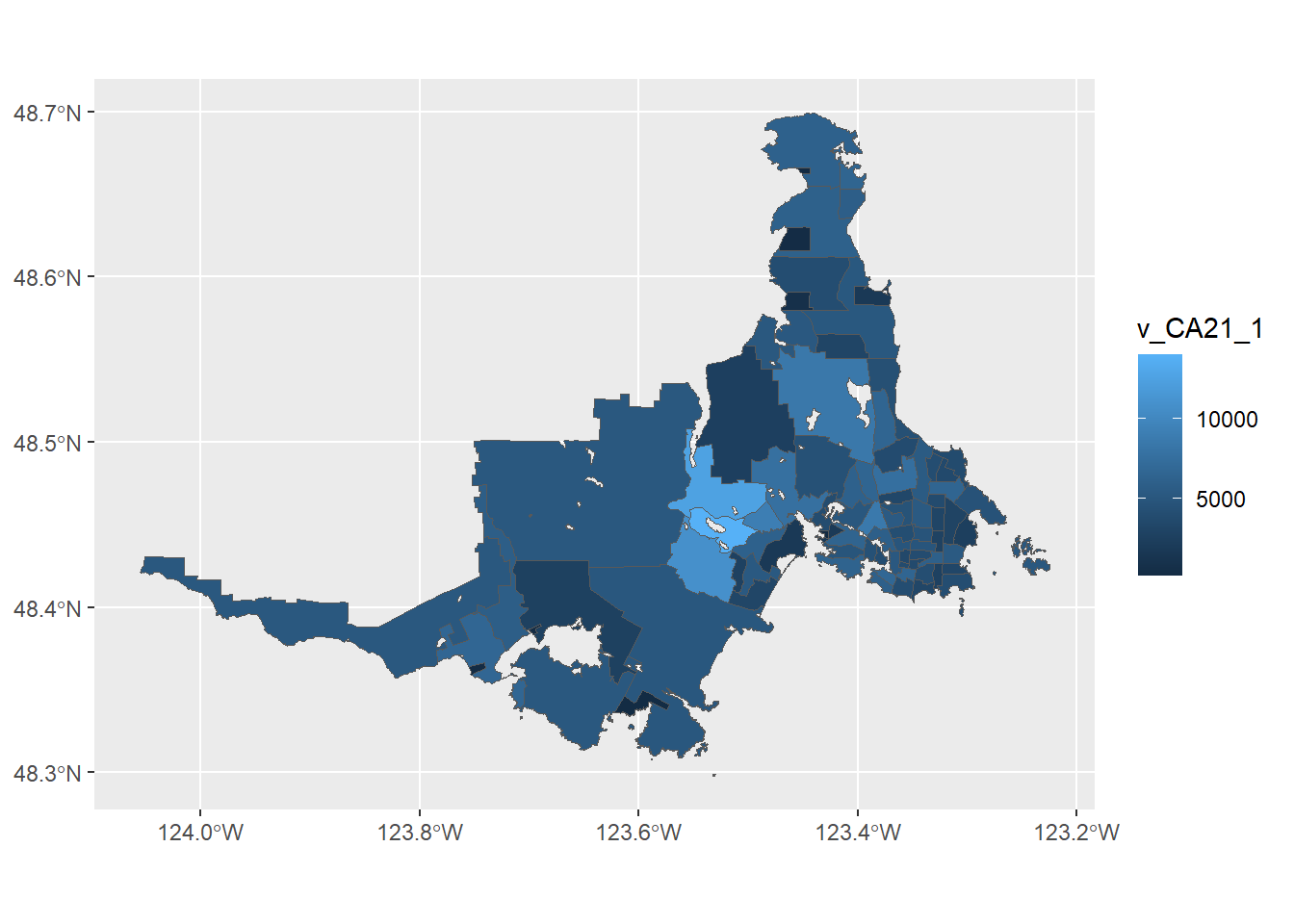
Dot density map
To make our map, we need to take the total population of each CT, divide it by the number of people we want to represent with a dot, and then randomly assign a location of dots within that CT such that the total population is represented.
Fortunately for us, Kyle Walker has included an as_dot_density() function in the {tidycensus} package. This function has arguments that depend on the {tigris} package that use the US Census shapefiles. Because of this dependency, these original tidycensus::as_dot_density() function won’t work for areas outside the USA.
I have taken the liberty of creating a simplified version of as_dot_density() in the code below that will work for the Canadian context. You’ll notice that the function relies on the {terra} package and the {sf} package.
as_dot_density <- function(
    input_data,
    value,
    values_per_dot,
    group = NULL
) {

  # If group is identified, iterate over the groups, shuffle, and combine
  if (!is.null(group)) {

    groups <- unique(input_data[[group]])

    output_dots <- purrr::map_dfr(groups, function(g) {
      group_data <- input_data[input_data[[group]] == g, ]
      group_data %>%
        terra::vect() %>%
        terra::dots(field = value,
                    size = values_per_dot) %>%
        sf::st_as_sf()
    }) %>%
      dplyr::slice_sample(prop = 1)

  } else {
    output_dots <- input_data %>%
      terra::vect() %>%
      terra::dots(field = value,
                  size = values_per_dot) %>%
      sf::st_as_sf()
  }
  # Sometimes, a strange dot gets thrown in.  Ensure this doesn't get returned.
  output_dots <- sf::st_filter(output_dots, input_data)

  return(output_dots)

}
In our as_dot_density() function we specify the dataframe, the variable (as value =) and the number of people to represent with each dot. For example, if the area has a population of 400 and you set values_per_dot = 10, it will assign 40 dots. After some experimentation, I landed on a value of 100 to produce a distribution I was happy with. I assigned this to an object people_per_dot so it can be used in the plot caption later.
people_per_dot <- 100

victoria_dots <- as_dot_density(
  input_data = victoria_cma_sf,
  value = "Population",
  values_per_dot = people_per_dot
)
With the 100 persons per dot calculation complete, they points can be plotted on the Census Tract map.
map_ct_dots <- map_ct +
  geom_sf(
    mapping = aes(),
    data = victoria_dots,
    size = 0.01
    )

map_ct_dots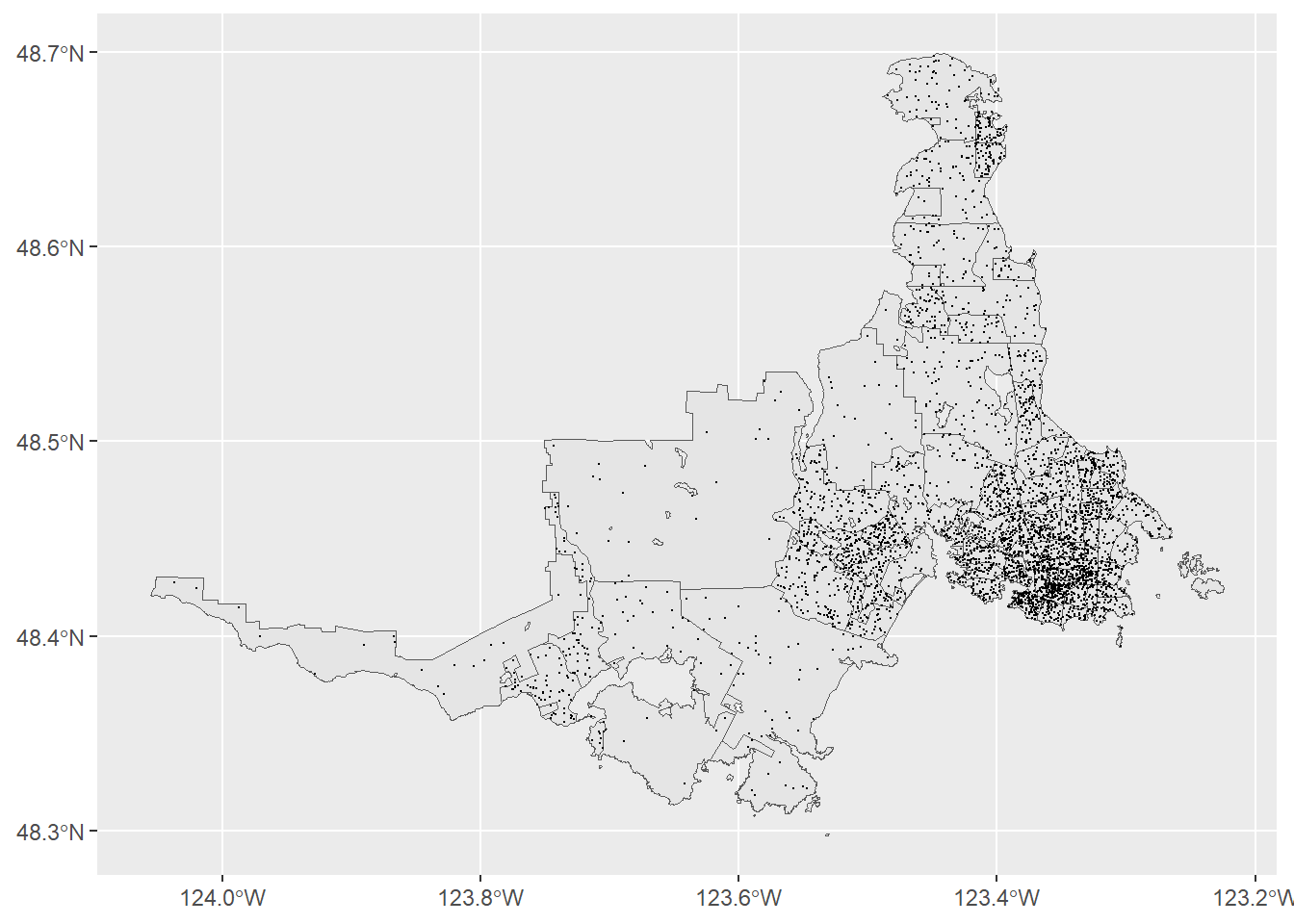
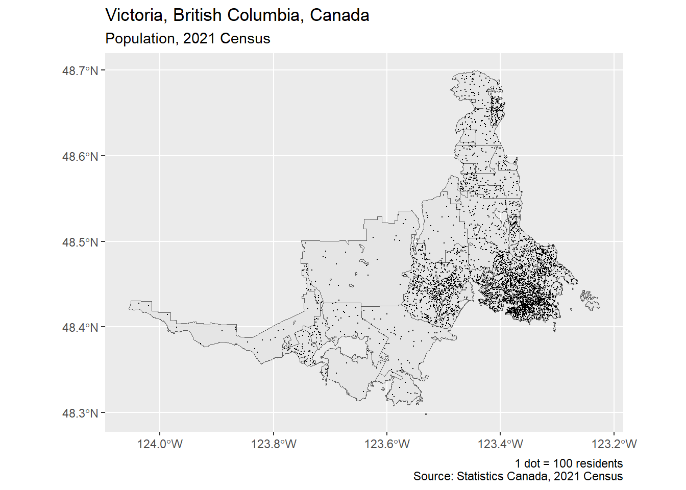
To this map, we can now apply some {ggplot2} formatting.
map_ct_dots +
  labs(
    title = "Victoria, British Columbia, Canada",
    subtitle = "Population, 2021 Census",
    caption = glue::glue(
      "1 dot = {people_per_dot} residents\nSource: Statistics Canada, 2021 Census"
    )
  )
-30-