When variables are, indeed, variable
This blog post is a long-form version of the talk I gave as part of the Data Mishaps virtual event on 2021-02-05. Thanks to the event organizers Caitlin Hudon and Laura Ellis for bringing together a variety of people to share their stories.
A bit of context
I have spent the largest proportion of my career as a public servant at BC Stats, the provincial statistics agency in British Columbia, Canada. I now have the title of “Provincial Statistician & Director”, which is (at least in part) the cause of imposter syndrome. In the context of this story, I hope telling you my job title demonstrates that it’s possible have a not-insignificant data mishap early in your career, learn from it, and survive to tell the tale.
When I first arrived at BC Stats in 1993, a big part of the job was estimating the impact of tourism on the provincial economy. This was a fairly novel exercise. The idea of calculating the contribution, and undertaking on-going monitoring of the tourism sector, had not been tried in many other places in the early 1990s.

Tourism isn’t an industry defined in the North American Industry Classification System (NAICS)1. Tourists purchase souvenirs from the retail industry, and buy services from food & beverage establishments, transportation companies, and accommodation providers. Innovative ways to capture the impact of tourism activity, particularly ones that could provide detailed regional breakdowns, were being sought.
My colleagues at BC Stats, prior to my arrival, had recognized the opportunity to calculate hotel and motel revenue (what we called “tourism room revenue”) by using the records of the amount of hotel tax paid to the Province by each accommodation industry business.2 Because we had access to confidential records of each individual business, we were able to calculate detailed revenue estimates by region and accommodation type, by dividing the tax collected by the tax rate.
The workflow looked like this:
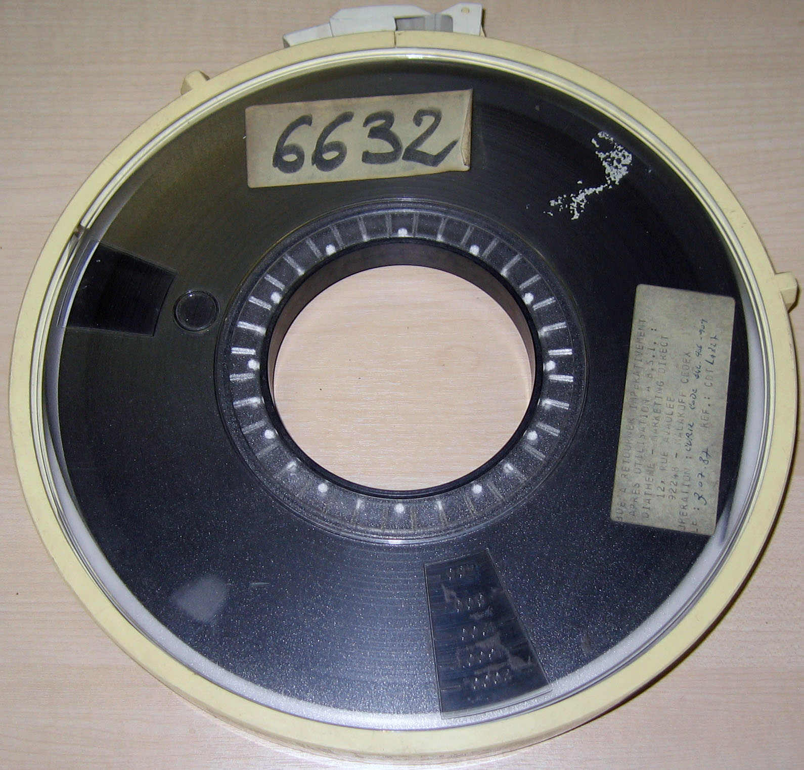
- The data came to us once a month, a single file of roughly 150 megabytes, copied onto two 10 1/2-inch (270 mm) data tapes from the B.C. Government’s mainframe computer, delivered by courier in a big pizza box.
- We then copied the data file from the tape using our “compact” tape drive and onto our one-and-only network drive.
- The raw data looked something like this:
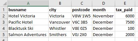
- Our database specialist had written some code, using dbase IV, that aggregated the revenue data and created detailed summary tables. The relational database had the raw tax data, and tables that provided details on each property, assigning the property to a category (e.g. hotel or B&B), and using the postal code to identify the city and region. Part of this step was transforming the tax collected into the revenue amount.
Based on the variable names in the table above, a more precise description of the data manipulation would be:
busname: join to a separate business listing table to assign property type, count of roomspostcode: geocode to city and region (Census Division)tax_paid: divide by the tax rate (7%) to derive a precise revenue amount
When I first started, the database processing had been taking roughly 12 hours, but when our DBA got a new computer with the first Pentium chip and 40 MB (yes, megabyte) harddrive, it dropped to six hours and we knew we were living in the future.
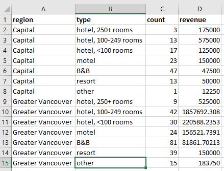
The individual records were aggregated (think
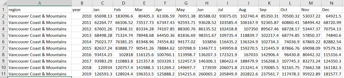
group_by()) region and property type into a single summary table, which was exported as a .db file. The monthly output file looked something like this:
- I then opened the .db file in Excel, and based on the workflow that my predecessor left me, undertook a number of manual point-and-click steps to restructure the data. This included transposing the direction of the monthly data so that each month was a row instead of a column, and appending that data to existing tables with all of the previous data series. These new tables looked like this:
- The final step was to create a report with summary tables, charts, and some analysis text. Here’s an example of one of those summary tables:
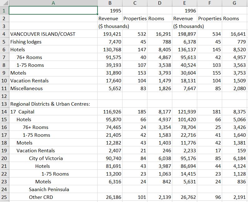
British Columbia Room Revenues and Property Counts, Annual 1995 to 1999
(And yes, I now know that it’s not in a tidy format!…but that’s not the data mishap of this story.)3

After a few months, I discovered that I could apply my rudimentary programming knowledge in support of my statistical analysis, and automate many of the steps using VBA for Excel.
And thus, I accidentally became a data scientist—before there was a term for such a thing.
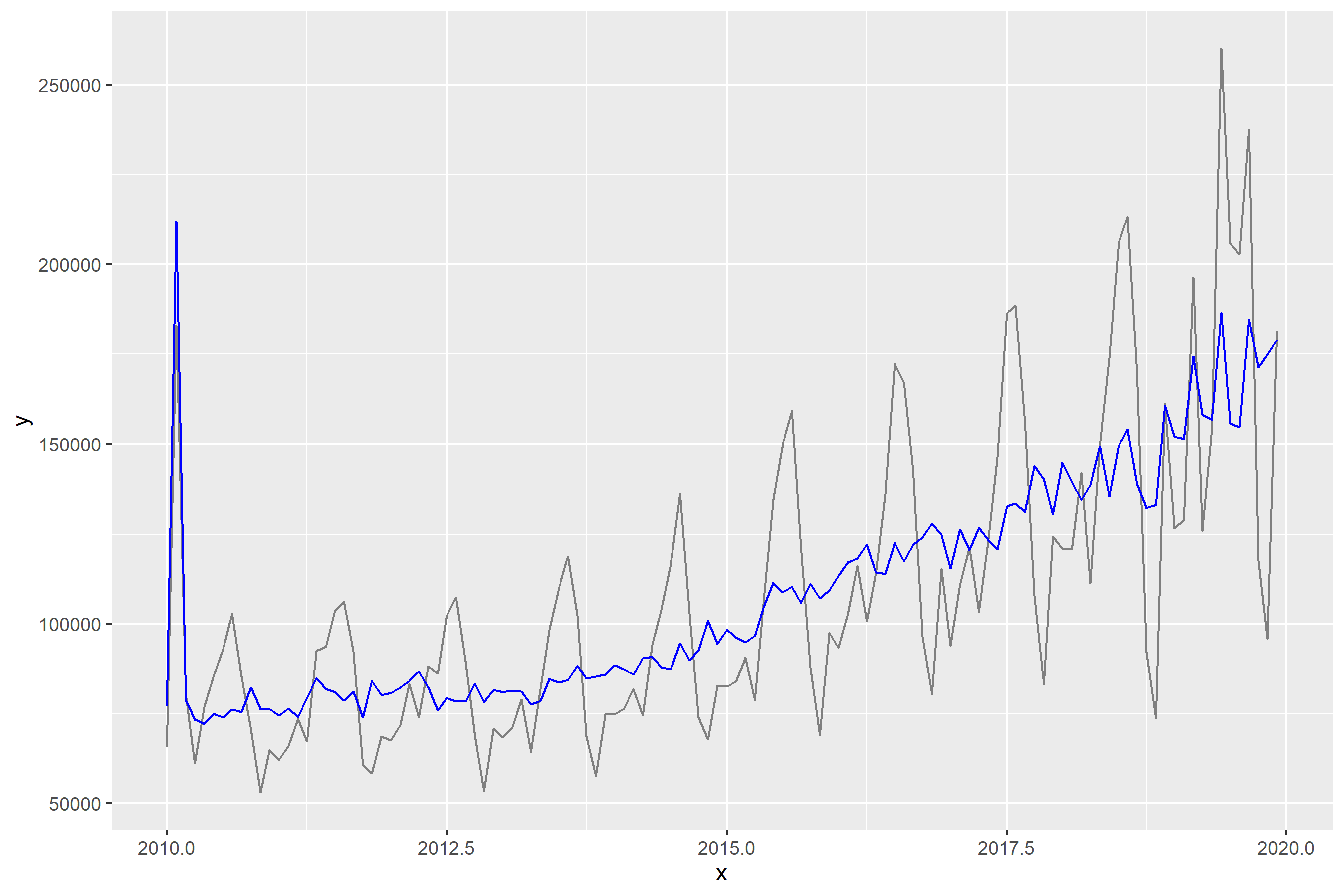
With the addition of automation, the monthly reports were getting done as efficiently as I could manage. This freed up some time, and I set about addressing the extreme seasonality in tourism activity in British Columbia.
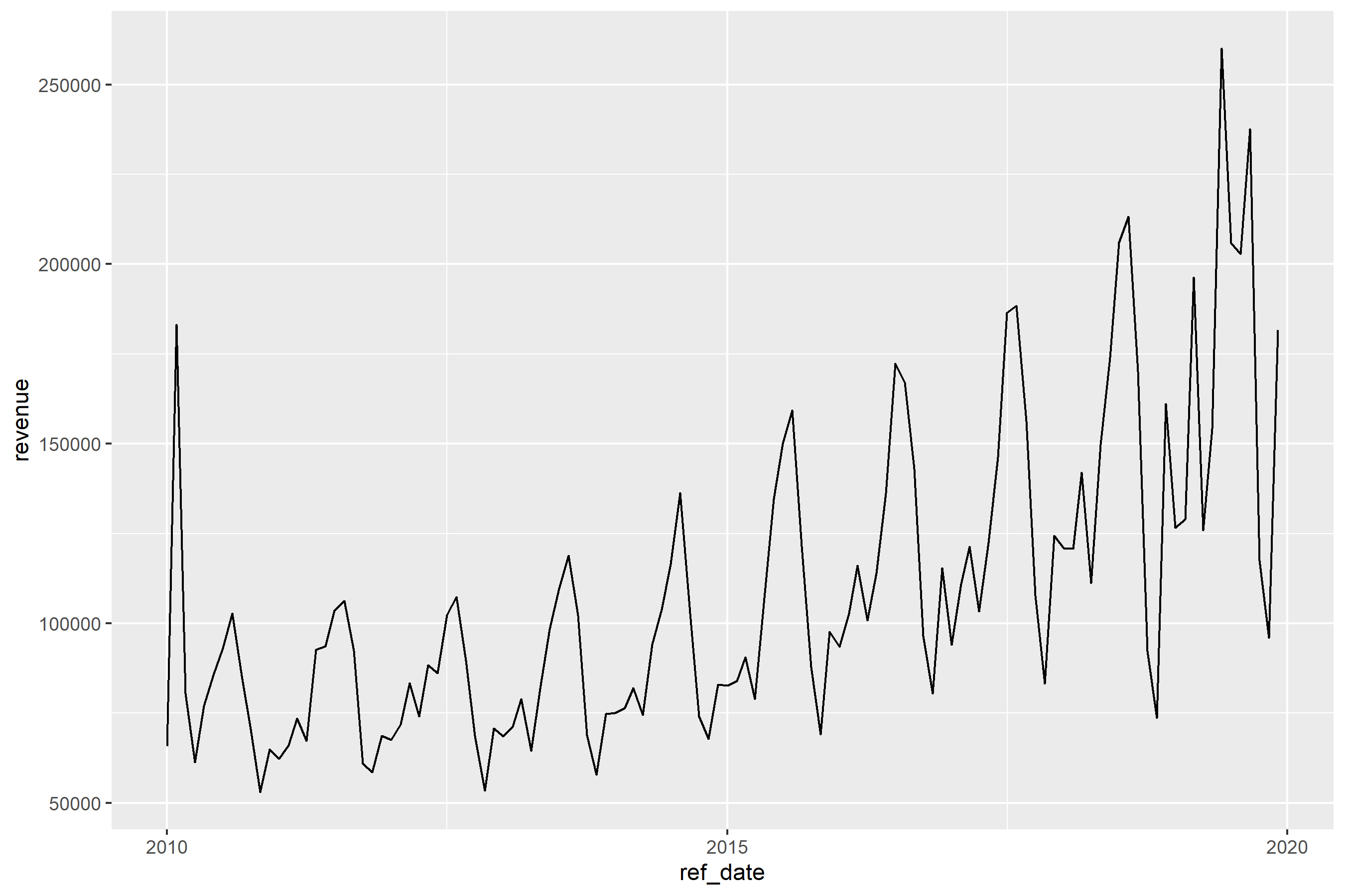
As the chart shows, tourism revenue in B.C. has a significant peak in the months of July and August, with intermediate peaks in December and January, and again in March and April. (There was the peak in February 2010 when Vancouver hosted the Winter Olympics, too.)
Working with one of the Economists at BC Stats, I learned about seasonal adjustment5 as a time series smoothing methodology, and the X-11-ARIMA software, used by Statistics Canada and the U.S. Census Bureau.
But in order to run the seasonal adjustment modeling, we needed more data…the hotel tax time series we had was not long enough to yield reliable results. So we went back to the folks running the mainframe, and got the tax records going back a few years.
After some more data restructuring and processing, I had run the X11-ARIMA software, and could produce a chart with a seasonally adjusted trend line.
The data tables with the extended series were published, and I turned my attention back to the regular monthly reporting and developing other statistical measures of tourism’s economic impact in British Columbia.
So what was the mishap?
The mishap lay hidden for a few months, until I attended a tourism industry conference in 1996. While there I spoke to a few people about the tourism room revenue report, and other initiatives measuring the size of the sector. I heard a number of conflicting stories about when the Hotel Tax collection started—some people pointed to 1986, when Vancouver hosted Expo 86; others pointed further back, to the late 1970s.
Being a bit of a “what are the true facts” sort of nerd, I decided to research the history of the tax, and write a short feature article about it.6

What I discovered was that prior to April 1993, the tax rate had been 8%—not the 7% that we had been using to calculate the estimate of accommodation revenue. This meant that while the revenue tables from April 1993 to (what was then) the present were correct, all of the revenue figures calculated for the period prior to April 1993 were too high (1 dollar of tax at 7% means revenue of 14.29; 1 dollar of tax at an 8% rate is 12.50 in revenue.)
From an analysis point of view, this meant that there was the appearance that the industry had stagnated for a year, when in fact it had grown.
The Response
There were four steps to the response:
Re-process the tabulations
Publish the correct tables
Add a revision note to the publication
Engage in a what I now would call a blameless post-mortem7
Lessons learned: Check your assumptions
The big lesson is to check your assumptions. This means to understand what’s being captured as the data is collected. What’s the precise question in the survey? How are the categorical variables defined? And as was the case here, has anything changed in how or what is being collected? More specifically, we need to know the specifics about how the data are collected—what exactly is being quantified?
It’s easy to overlook an apparently unchanging variable, like I did. We need to remember that something that looks on the surface as consistent can be influenced by elements that are not directly part of the measure, but which themselves vary.
In my case, the values being captured in the data precise, to the penny: it was exactly the amount paid to the Province of British Columbia, and there was a team of auditors checking to make sure that was the case. But the tax rate had changed, so my revenue calculations were inaccurate. Ok, the calculations were wrong.
In other disciplines, a variety of issues can have an impact on the data. Here’s some other examples of variable variables that spring to mind (I’m sure there are more):
In the field of economics, there are differences in how countries calculate things like GDP. A recent episode of the BBC podcast More Or Less investigated the differences in how COVID-19 has impacted the GDP of the UK and other European countries—but the most important difference is in how “GDP” is calculated.
A recent report from Reuters on air quality measurement stated “Nearly half of the country’s monitors meant to capture fine particulate matter did not meet federal accuracy standards.”8 This information about accuracy is vital to know if you were going to compare the air quality data in two different locations.
Sports analysis that looks at historic trends can also encounter variable variables. There can be significant year-over-year changes in rules, or differences in rules between leagues, that can have an impact on what are superficially the same data variables. One example is what is now known as the “foul-strike” rule in baseball: it was adopted in the National League in 1901, but not until 1903 in the American League. An analyst comparing strike-out and walk rates in these two seasons will have to be aware of this rule difference.
Another example from baseball is the fact that every baseball park has different outfield dimensions, as well as different “in play” foul territory. Furthermore, these dimensions at the same stadium can change from one year to the next—between the 2012 and 2013 seasons, the outfield fence of (what was then) Safeco Field in Seattle were moved in between 4 and 17 feet (1.2 to 5.2 meters), with the goal of making it easier for batters to hit home runs.
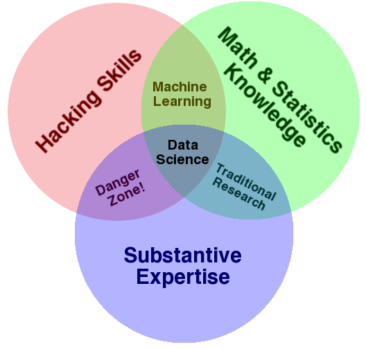
Another way to frame this is to develop substantive expertise. As shown in Drew Conway’s famous data science Venn diagram9, this is an essential ingredient of successful data science.
Stories like this are more common than we might like. But sharing them will help others learn from our mishaps, and they will avoid making them too.

-30-
Footnotes
North American Industry Classification System at Wikipedia↩︎
At the time, British Columbia had a separate Hotel Tax which was levied on all short-term accommodation in properties with four or more rooms. The Hotel Tax has now been repealed, and the general Provincial Sales Tax is now charged on accommodation.↩︎
I can’t recommend enough the paper by Karl Broman and Kara Woo, “Data Organization in Spreadsheets”, 2018, The American Statistician↩︎
Susie Fortier and Guy Gellatly, Seasonally adjusted data – Frequently asked questions↩︎
“The Hotel Room Tax Act—A Brief History”, B.C. Tourism Room Revenue Report, BC Stats, September 1996 (PDF).↩︎
I first learned about “blameless post-mortem” from Hilary Parker, who has mentioned them more than once in her role of co-host of the podcast Not So Standard Deviations; you can also read about Google’s approach to blameless post-mortems.↩︎
“U.S. air monitors routinely miss pollution - even refinery explosions”↩︎